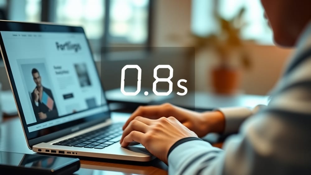
Your portfolio has about 800 milliseconds before a hiring manager decides whether to keep scrolling or close the tab.
That is not a metaphor. Eye-tracking studies from 2025 and 2026 consistently show that recruiters form a first impression of a candidate's digital presence faster than a blink. The cruel irony: most developers and designers spend 90% of their portfolio effort on things that don't matter in that window, and almost nothing on the things that do.
Here is what is actually getting you dismissed, and how to fix it.
The Real Reason Is Scannability, Not Polish
Hiring managers are not sitting down with a coffee to appreciate your custom cursor animation. They are triaging. On a busy day, a senior recruiter at a mid-size tech company might review 40 to 60 portfolio links. Your site gets a glance, not a read.
The mistake most candidates make is optimizing for the 10-minute deep-dive that almost never happens. What you should optimize for is the 1-second scan that determines whether the deep-dive ever begins.
Scannability beats polish every single time. A clean hierarchy that communicates "I am a React developer who builds e-commerce tools" in under two seconds will outperform a beautifully animated site that takes three seconds to load and five more to figure out.
What Actually Stops Recruiters Mid-Scroll
Based on real hiring manager behavior data from 2025 and 2026 recruiting studies, here are the specific friction points that cause immediate dismissal:
No clear role declaration above the fold. If your headline is your name and nothing else, you have already lost. The first thing a recruiter needs to know is what you do and what kind of work you are looking for. "John Smith" tells them nothing. "Full-Stack Developer, React and Node.js, Open to Remote Roles" tells them everything in one line.
Project thumbnails without context. A grid of pretty screenshots looks impressive until a recruiter realizes they have no idea what any of these projects are, what problem they solved, or what your actual contribution was. A thumbnail needs a title, a one-sentence description, and the tech stack visible without clicking.
Walls of text in the About section. Nobody is reading your three-paragraph origin story on the first pass. Recruiters want to extract three things fast: your specialty, your experience level, and whether you are available. If those answers are buried in prose, they will move on.
Slow load times killing the first impression. A 2026 report from a major job platform found that candidate sites with load times above 3 seconds had measurably lower recruiter engagement, even when the content quality was higher. Your hero section needs to load fast, or none of the other fixes matter.
No obvious next step. If a recruiter is interested after 30 seconds but cannot immediately find how to contact you, you have burned the opportunity. Contact details or a prominent button should be visible without scrolling on desktop and mobile.
The Scannability Audit: Five Fixes You Can Make Today
Run this quick audit on your current portfolio:
-
The 5-second test. Send your portfolio URL to someone who has never seen it and ask them what you do, what kind of work you make, and how to contact you. If they cannot answer all three in 5 seconds, you have a scannability problem.
-
Add a role declaration to your hero. Your headline should be a tight professional statement, not just your name. Think job title plus niche plus one differentiator.
-
Add visible metadata to every project card. Title, one-line summary, tech stack. No click required. If a recruiter has to open a project to understand what it is, most will not bother.
-
Cut your About section in half. Then cut it in half again. Use bullet points. Lead with your specialty and availability, not your backstory.
-
Run a mobile load test. Use PageSpeed Insights on your portfolio URL right now. If your mobile score is below 70, fix performance before you fix anything else.
Why Most Portfolio Advice Gets This Wrong
The standard advice is to "make your portfolio stand out" or "show your personality." That is not wrong exactly, but it is being applied at the wrong stage. Personality and creative flair matter during the deep-dive phase, when someone is already engaged. They do not matter during the triage phase.
Think of it in two stages. Stage one is the 1-second scan: can I tell what this person does and whether it is relevant to me? Stage two is the 5-minute review: is this person's work strong, interesting, and trustworthy? Almost all "make it stand out" advice applies to stage two. But you only get to stage two if you pass stage one.
Optimize for stage one first. That means hierarchy, clarity, speed, and a visible role declaration. Then layer in the personality.
Build a Portfolio That Passes the 1-Second Test
CV2Folio is built specifically around this insight. Instead of dropping you into a blank canvas and hoping for the best, CV2Folio takes your existing CV or resume and generates a portfolio structure that puts the right information in the right place from the start. Role declaration at the top, project metadata visible, contact clear. The scannability is built in, not bolted on after.
CV2Folio is built by Novion and is designed for developers, designers, and freelancers who know their work is strong but need a portfolio that actually communicates that in under a second.
The goal is not a portfolio that impresses you. It is a portfolio that survives the first second of a recruiter's attention, and earns the next sixty.
Build your portfolio at cv2folio.novion.one